Candlestick charts are essential for analyzing crypto markets. This beginner’s guide explains how to read candlesticks, understand price movements, and identify trading signals using simple visual tools.
Trade Bitcoin and other cryptocurrencies with the self-custody Bitcoin.com Wallet app.
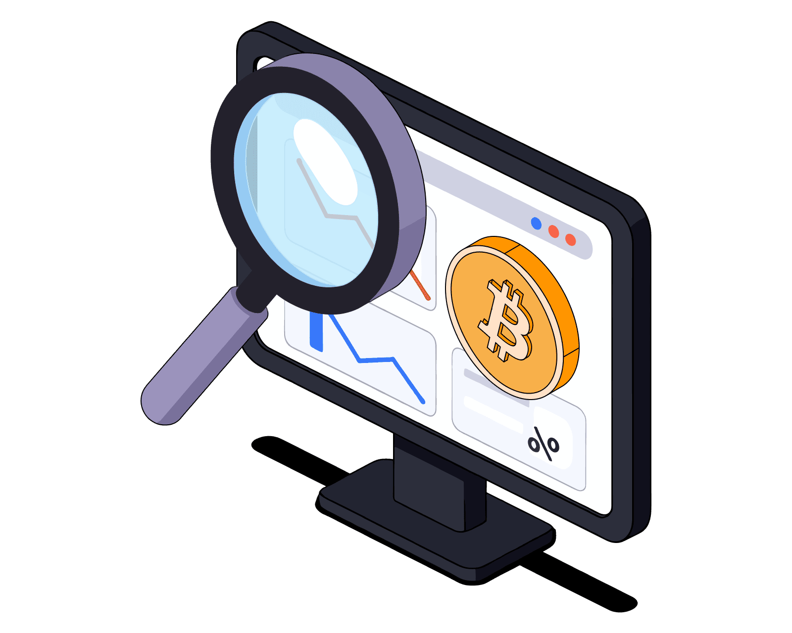
A Beginner’s Guide to Candlestick Charts
Welcome to the first article in our Bitcoin.com Trading series – designed to help you understand and confidently use candlestick charts.
If you’re new to trading or investing, making sense of market charts can feel overwhelming. Terms like “bullish engulfing” or “hammer pattern” often sound more confusing than useful. This series breaks everything down step by step, starting with the basics.
Candlestick charts are one of the most essential tools in a trader’s toolkit. They’re fast, visual, and packed with information – making it easier to interpret price action and spot opportunities.
By the end of this article, you’ll understand what candlestick charts are, how they work, and why they’re especially useful in crypto trading – particularly when identifying trends, reversals, and potential entry or exit points.
Disclaimer: This article is for educational purposes only and does not constitute financial advice. Always do your own research before making investment decisions.
What is a candlestick chart?
A candlestick chart shows how the price of an asset moves over a specific period of time. Each “candlestick” on the chart represents a set time interval – like 1 minute, 1 hour, 1 day, or even 1 week. You’ll often hear traders refer to the time period as the “timeframe.”
Candlestick charts are used across all financial markets – crypto, stocks, forex, and more – because they quickly show whether prices went up or down, how much they moved, and where the action happened.
Candlestick charts were first developed by a Japanese rice trader named Munehisa Homma in the 1700s. The technique gained popularity in the West after being introduced by Steve Nison in his 1991 book Japanese Candlestick Charting Techniques.
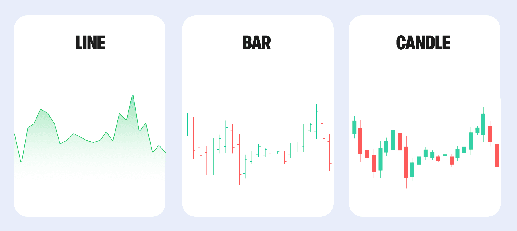
Chart types: Line vs. Bar vs. Candlestick
Before we dive deeper, it helps to understand how candlestick charts differ from other common chart types:
Chart TypeShowsProsConsLineOnly closing pricesSimple, clean view of overall trendLacks detailBarOpen, High, Low, CloseMore data-rich than line chartsHarder to read quicklyCandlestickOHLC with color-coded bodiesVisual, intuitive, easy to spot patternsCan be noisy on lower timeframes
Most crypto traders prefer candlestick charts because they offer the best of both worlds – visual clarity and detailed price data.
While bar charts show the same key price points – the open, high, low, and close – candlestick charts are generally easier to read and more intuitive. That’s why most traders, especially in crypto, use candlesticks to spot trends, reversals, and key trading signals more confidently.
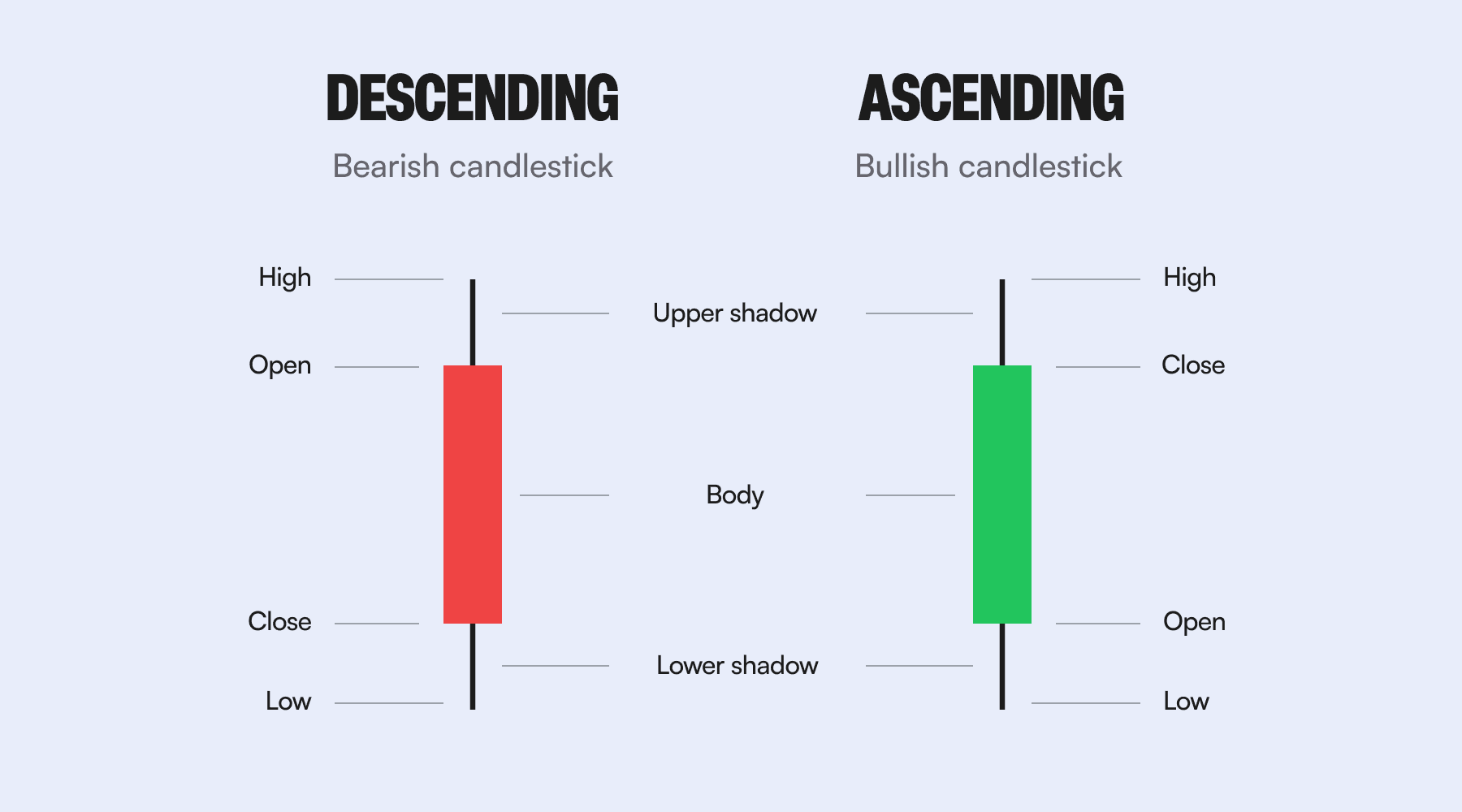
The anatomy of a candlestick
Each candle tells a story through four key data points:
- Open: the price at the start of the timeframe
- High: the highest price reached
- Low: the lowest price reached
- Close: the price at the end of the timeframe
Together, these are called OHLC data.
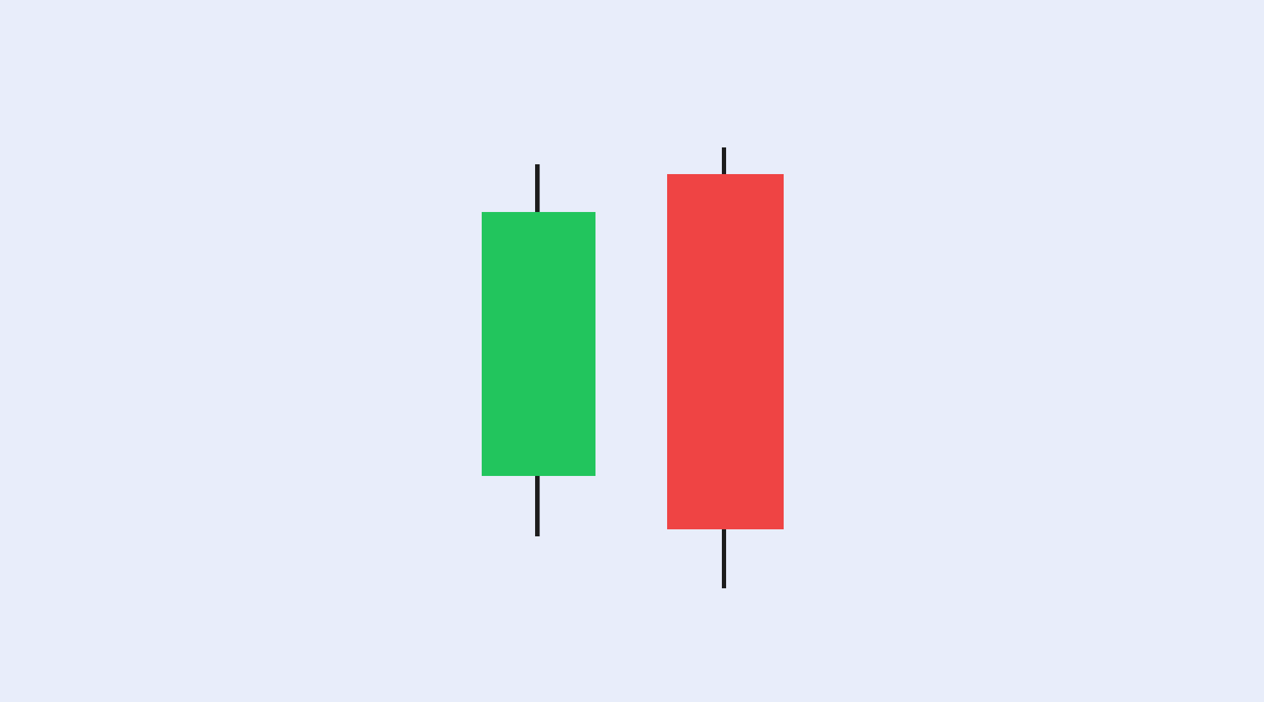
The candle is made up of two main parts:
- The body: shows the difference between the open and close
- The wicks (or shadows): show how high and low the price went during the timeframe
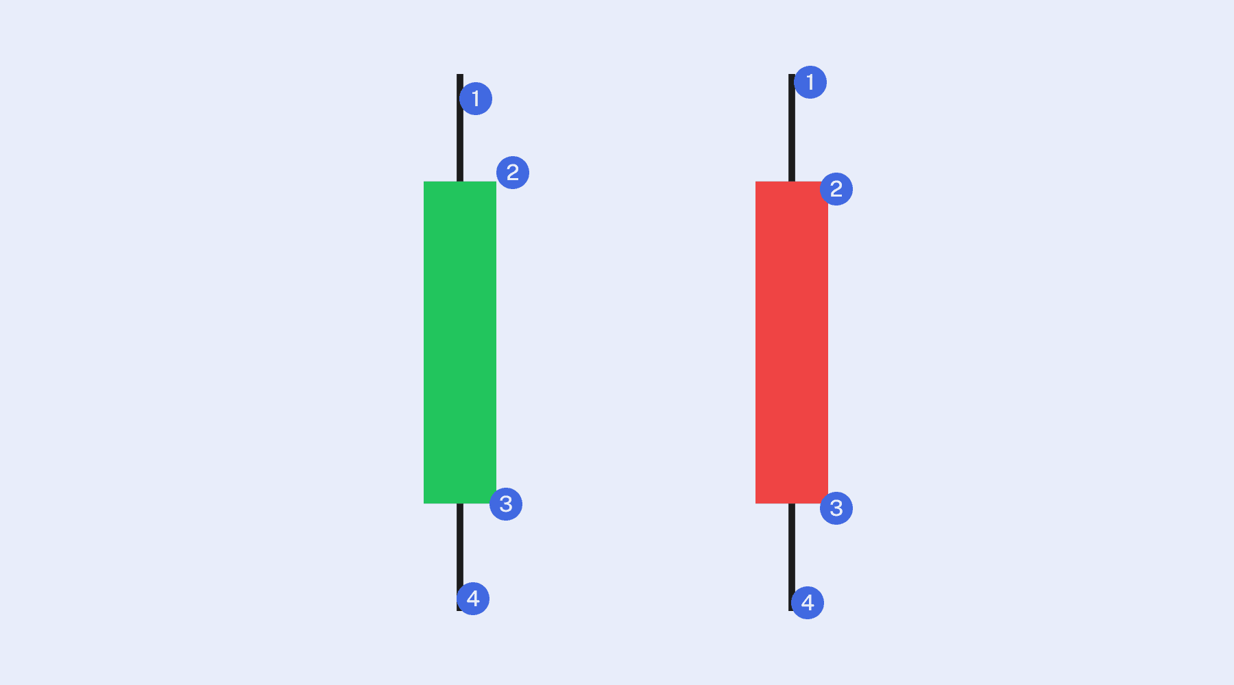
Descending candlestickAscending candlestickUpper wick: highest traded price in that period.1Upper wick: highest traded price in that period.Open: first traded price in that period.2Close: last traded price in that period.Close: last traded price in that period.3Open: first traded price in that period.Lower wick: lowest traded price in that period.4Lower wick: lowest traded price in that period.
If the close is higher than the open, the candle is usually green (bullish). If the close is lower, the candle is red (bearish). Some charting platforms use white and black candles instead.
Sometimes, only one wick is visible. That happens when the open or close is the same as the high or low – meaning one edge of the candle aligns exactly with the top or bottom of the range.
What candlesticks reveal
Candlesticks form one after another on the chart, creating a visual history of price movement. Here’s what you can spot at a glance:
- Long green candles – strong buying pressure
- Long red candles – strong selling pressure
- Small bodies with long wicks – indecision or potential reversal
- Consistent patterns – possible trend continuation or reversal signals
Even without technical indicators, candlestick charts can help traders identify support and resistance levels, breakouts, reversals, trends, and entry/exit zones.
A note on candlestick patterns
Over time, traders noticed that certain candlestick formations tend to appear before price reversals or breakouts. These are known as candlestick patterns, and they’re often used to anticipate market behavior – especially turning points.
While no pattern is 100% reliable, some are considered strong signals when combined with other tools. For example:
- Hammer / Rising Hammer – May signal reversal at the bottom of a downtrend
- Shooting star / Falling Hammer – Potential top of an uptrend
- Three white soldiers / three black crows – Trend continuation indicators
- Spinning top – Market indecision that often precedes reversals
Many traders build their entire strategy around recognizing and reacting to these patterns. We cover these patterns – and many others – in dedicated articles that break down how each one works and how traders use them in real-world scenarios.
What candlesticks don’t show
Candlesticks are useful – but they don’t tell the whole story. For example:
- The exact sequence of price movements (e.g. whether the high or low came first)
- Detailed activity between open and close
- Price gaps in certain formats
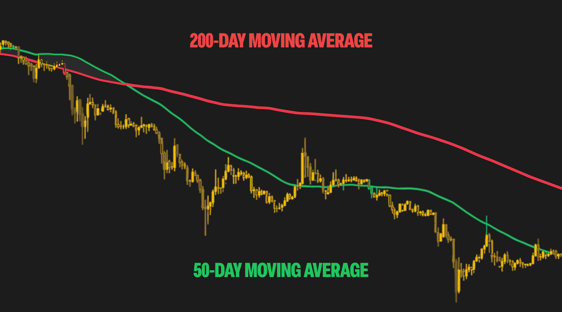
On shorter timeframes, candlesticks can also create a lot of market noise – rapid changes that may not reflect a true trend. Zooming out to longer timeframes (e.g. 1-hour, 1-day) often gives a clearer view.
Heikin-Ashi: A smoother alternative
While standard “Japanese candlesticks” are the most common, another type called Heikin-Ashi offers a smoothed version of price action by averaging out data.
- Green Heikin-Ashi candles with no lower wicks = strong uptrend
- Red candles with no upper wicks = strong downtrend
Heikin-Ashi is great for identifying trends and reducing false signals – but it’s slower to react and doesn’t show precise prices, which makes it less useful for short-term entries.
Many traders use both styles together – standard candles for entry/exit precision, and Heikin-Ashi for overall trend direction.
Why candlesticks matter in crypto
Candlestick charts are especially useful in crypto because they are:
- Easy to read – The visual format makes it simple to see whether price moved up or down
- Easy to interpret – Each candle tells a clear story of buying or selling pressure
- Easy to spot trends – Patterns form quickly and repeat often, making it easier to identify momentum shifts
In fast-moving markets like crypto, where prices can change rapidly and technical signals matter, candlesticks offer a quick way to stay informed and react with confidence.
Whether you’re tracking Bitcoin’s long-term trajectory or trading altcoins on shorter timeframes, learning to read candlestick charts gives you an edge.
Final thoughts
Candlestick charts give traders a visual way to understand price action – showing not just where price has been, but how it moved along the way. Learning to read them is a foundational skill in crypto trading.
Pair this knowledge with risk management, fundamental analysis, and consistent practice – and you’ll be in a much better position to make smarter trading decisions.